Wednesday 29 January 2014

FINAL FILM POSTERS


These are our final individual posters promoting the characters of Jack Pseudo. They feature similar styles and designs with the same logo, fonts and colour palette to create synergy and continuity. A tagline has been used with each individual character to give a clue to the audience as to what their character is about or who they are.


This is the final design for our poster promoting the film Jack Pseudo. We decided this as our final poster as after much consideration and planning, we decided a simple layout and design was very effective. This idea was instigated from our initial research on film posters, in particular, 'Insidious'. 'Insidious' was the perfect example of how a simple design can powerfully entice audiences. 

Monday 27 January 2014

FILM POSTER DEVELOPMENT

These are our initial designs for our film poster. We booked the college's photography studio to shoot rough cast photos of the three main starring characters: Zara Mills, Holly Smith and Jack Psuedo. We chose the shot we captured of the two companions back to back as it highlights the storyline of the two's alternate personalities. We decreased the saturation of the image to relate to the film's horror convention, though the pitch black background was increased in contrast to give a striking appearance to the design and allow text to be clearly visible over the layer. We then placed the main character in the centre across the two women and reduced its opacity to show the supernatural ghost-like nature of Jack's character. Finally, we added a logo through the centre of the page to appear striking and used a slashing-type font, again to relate to conventions of horror films. We finally, added the cast names at the top of the poster, and credits at the bottom, with a "Coming Soon" sub-caption and a 3D feature.


The second design added a red line through the logo to connotate danger or blood. In addition, a tag-line "The Truth Is Not All It Seems" was added below the film's logo and further credits were added. For the third design, a glow was added for "Coming Soon" to make it more visible to the audience. The fourth draft included adding a smoke filter over the top of the layers to add to the ghost/supernatural storyline featured in the film. The fifth design presented the character's in their correct outfits in reference to the character profiles powerpoint. We thought this design was good, though it was too close-up for a film poster. Our final design shows more establishing shots of all three characters and uses the transparency effects to merge the three together to represent that they are linked. Furthermore, upon research of other film posters, we incorporated social media links and a website at the bottom of the poster.

Sunday 26 January 2014

INITIAL CAST PHOTO IDEAS


These photos are from our first initial photo shoot related to the main characters of our film Jack Psuedo, shot in the college's professional photography studio. We chose a black backdrop for the cast photos to create a dark and sinister ambiance relating to typical horror conventions. We used props such as chairs to provide different stances to work with in the editing stages. While the photos are shot well and the composition is successful, we think that certain facial expressions such as smiling does not suit our movie as it is a haunting and psychological story line. However, the main idea behind the shoot was to get some initial photos of the cast to work with and gain ideas as to how we could arrange our advertisements. In the editing stage, we used filters such as grayscale and increased the contrast to create an eerie, sinister and more striking effect. We plan on using the studio again to shoot our final cast images, but will choose appropriate costumes, possibly those featured in our trailer footage to create synergy and continuity.  

Monday 20 January 2014

MAGAZINE COVER IDEA

For our self-designed magazine cover, our group had an idea referenced from the album cover of the band The Script's album #3. We think this design would work for our desired film trailer as the black and white colour palette is extremely striking to the eye and fits with our horror/thriller genre. Furthermore, the idea of the heads being intertwined would relate to our group's storyline of the character Jack Pseudo's mentality and connection to the two women Zara and Holly. To achieve this similar effect, we have booked to use the college's photography studio to take further photo shoots for our film. In this, we aim to capture various vantage points of the character's close-up faces. We will use Adobe Photoshop to edit these individual characters and piece them together. We will aim to keep the magazine cover fairly basic as we think this will be successful in creating the striking effect. We have also researched into various magazine covers to achieve a sense of professionalism.

Sunday 19 January 2014

EMPIRE MAGAZINE RESEARCH


This is the masthead of the well known film magazine 'EMPIRE'. Every magazine issue has exactly the same masthead, with the same font and colour red, which can be referenced as synergy. They do this so it is easy to recognise. Occasionly they will change the colour of the masthead so the issue doesn't get boring and appeals to the audience; they will think they are buying something new, different and exciting, which will therefore increase sales. They also, change the colour to match with the main image. The colour red represents danger which can suggest that the magazine is exciting and if you are buying it you are taking a risk, which will make the readers want to buy it. The big and bold font makes the masthead really stand out and you can recognise what magazine it is, so you will not get distracted looking at other magazines while trying to look for it. We have taken inspiration from this masthead as we think it really stands out and looks effective, as it gives you the message that the magazine will be filled with new, current and exciting films. We have also used the colour red for our masthead title on all of our magazine and film posters. This gives our work synergy so you can easily tell that our magazine covers and posters are promoting our film trailer 'Jack Psuedo'. Finally, we have used the colour red as it appeals to both a female and male audience. 

All of these magazine covers consist of a main image of the central character of the film. This promotes the film as well as giving the readers an idea of the main actor of the film. As you can see all of the actors are in their character's clothing this just gives the readers an idea of the film's storyline. We are going to have  the main image on our magazine cover of all of us as we are the main characters. However, Jack will be in the centre as he is the villain who brings Holly and Zara together. We will also be in suitable clothing to suit our character's personality's. The magazine covers also all have tag lines to give the readers an insight into what else is in the magazine. We will use appropriate tag lines on our magazine, for example ones about the latest and must watch films of 2014. The magazine covers also include barcodes which we will include on our own Empire cover to give a sense of realism. Furthermore, the additional text surrounding the main image is typically in reference to other films or features included within the magazine. We will incorporate this idea into our own design. We will also include our own tag line atop the magazine logo. 

Monday 13 January 2014

EDITING PROCESS #3


Today was the day we finally managed to include all the recorded footage and start to plan things such as transitions, timing, effects and music. We also managed to learn the skill of including a split screen after researching online at this website: http://makezine.com/projects/split-screen-effect-w-imovie/ Below shows the page we referenced and our group creating this effect using iMovie. Although we were proud of the fact we managed to learn a new effect to add to our trailer, we decided after much consideration a split screen wouldn't be the best idea.

Overall we have managed to complete our opening scene, add music and started to include the voice over so it would fit accordingly.

Monday 6 January 2014

TRAILER SCRIPT QUOTES


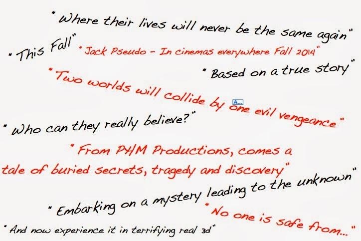
This is a screenshot showing various quotes we want narrated for our trailer. We researched into existing horror trailers with specific narrative voice-overs and found that most of them featured a low American accent style voice. For this, we will get a friend of one of the members of the group who is American to record a voice-over and add it into our movie recordings. We have included quotes featuring our company name, dates and information on the story line.

Friday 3 January 2014

EDITING PROCESS #2

The following footage is an example of the different locations and scenes we've shot in. As a group we have made a great amount of progress in terms of sticking to the scheduled filming time and making sure we use up all the available time we have to film to a high standard.


We are now beginning to select clips which we believe will be most valuable in our trailers. We have made a great amount of effort to work in good time to allow us the space to go back and amend any errors and make our footage even better.